Intro
Have you ever stumbled upon a problem that you knew would be an enormous waste of time but still felt compelled to solve it? For me recently, it was this underline animation. It’s used a bunch throughout my site. What started out as a simple CSS class quickly ballooned into an effort that involved profiling stylesheets and diving deep into the Tailwind plugin system.
Did I learn a lot? Yeah, I did. Does it accommodate any new use cases? Not unless I find a place for a hot pink underline. But at the very least, I can document my learnings for anyone who may run into the same class of problem and is looking to address it using Tailwind's very powerful plugin system.
Implementation
First Attempt - Vanilla CSS
The humble underline started out as a simple decoration for links from my previous website. It was implemented as a CSS class and stored directly in globals.css .
.decorate-underline {
  @apply text-blue-500;
  display: inline-block;
  position: relative;
  &::after {
    @apply bg-blue-500;
    content: "";
    position: absolute;
    width: 100%;
    transform: scaleX(0);
    height: 2px;
    bottom: 0;
    left: 0;
    transform-origin: bottom right;
    transition: transform 0.25s ease-out;
  }
  &:hover {
    &::after {
      transform: scaleX(1);
      transform-origin: bottom left;
    }
  }
}
Apart from the use of Tailwind @apply directives, this is as close to vanilla CSS as it gets.
Take Two - Highlighting Selection
As I was implementing my new site, I had a few places where I needed a selection indicator. That's where the idea of reusing the animated underline came from. However, since the previous class was made for URLs where the color was coupled with it, a simple duplicated class with a few minor tweaks was sufficient. This proved to be a good enough solution.
.decorate-underline {
  display: inline-block;
  position: relative;
  &::after {
    @apply bg-foreground;
    content: "";
    position: absolute;
    width: 100%;
    transform: scaleX(0);
    height: 2px;
    bottom: 0;
    left: 0;
    transform-origin: bottom right;
    transition: transform 0.25s ease-out;
  }
  &:hover,
  &.selected {
    &::after {
      transform: scaleX(1);
      transform-origin: bottom left;
    }
  }
}
With this class, you would get the nice underline on hover as well as when the .selected is also applied.
The Tailwind Saga

This is where I had the (not so) brilliant thought: can this solution be generalized? In my defence, every developer has these thoughts. But most do not act on it because YAGNI, KISS, etc etc. For me however, my curiosity got the best of me this time.
Since I'm using Tailwind, it naturally became part of the solution. Here was my first crack at it:
export const decorateUnderline = plugin(function ({ addComponents, theme }) {
  const colors = theme('colors') as Record<string, string | Record<string, string>>

  const baseStyle = (color: string) => ({
    display: 'inline-block',
    textDecoration: 'none',
    position: 'relative',
    '&::after': {
      content: '""',
      position: 'absolute',
      width: '100%',
      transform: 'scaleX(0)',
      height: '2px',
      bottom: '0',
      left: '0',
      transformOrigin: 'bottom right',
      transition: 'transform 0.25s ease-out',
    },
    '&:hover, &.selected': {
      '&::after': {
        transform: 'scaleX(1)',
        transformOrigin: 'bottom left',
        backgroundColor: color,
      },
    },
  })

  Object.keys(colors).forEach((colorName) => {
    const color = colors[colorName]

    if (typeof color === 'object') {
      Object.keys(color).forEach((shade) => {
        addComponents({
          [`.decorate-underline-${colorName}-${shade}`]: baseStyle(color[shade]),
        })
      })
    } else {
      addComponents({
        [`.decorate-underline-${colorName}`]: baseStyle(color),
      })
    }
  })

  addComponents({
    '.decorate-underline': baseStyle(theme('colors.foreground')),
  })
})
This plugin can then be plugged into tailwind.config.ts.
const config = {
...
plugins: [ ..., decorateUnderline], // [!code focus]
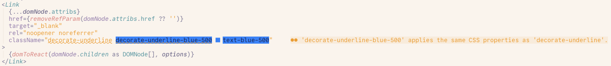
} satisfies ConfigThe end result of all this was that it would generate classes for every single Tailwind colour and shade, exactly what wanted. I can use any of the The best part about implementing this as a Tailwind plugin is that it gets suggested by LSPs, just like any other Tailwind token.
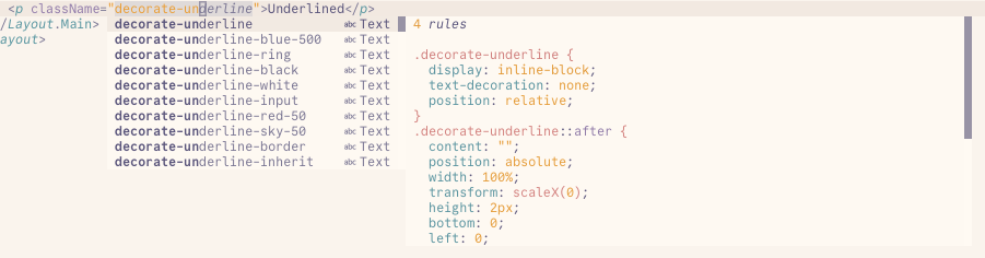
I even got lint suggestions for when classes are duplicating CSS properties.
Boom, solution generalized. Working better than I expected. Or so I thought...
Take Four — Footgun Found
By now you've probably figured it where the footgun is. If you work with Tailwind CSS, you are likely familiar with the concept of class pruning. Pruning is a very crucial step for Tailwind — it ensures that the styles that aren't used anywhere in your app are not included in the final stylesheet.
I discovered my mistake a few days later when I was debugging something else. In the production build, I noticed that my stylesheet was larger in size than some of the client components that I was sending down the wire. A quick inspection of the sheet and the problem became obvious: the classes were not getting pruned.
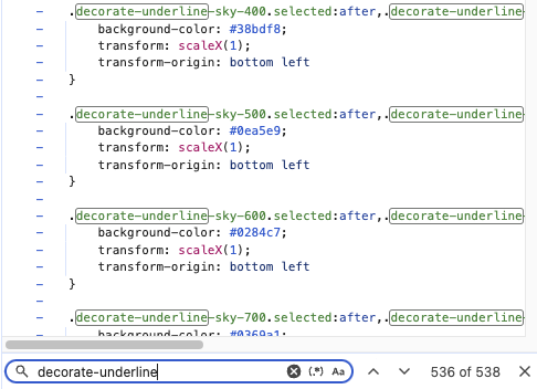
Back to the drawing board. The main culprit was that I did not internalize how Tailwind tokens are structured and, therefore, how they are pruned.
Drawing Inspiration
The intention with the original implementation was that only one class would be necessary to use the style. This thought process stemmed from how classes were originally implemented. The "one class" rule was enforced via the linter, which led me to think that the implementation was fine.
But this approach actually goes against how Tailwind tokens work. Take the shadow class for example: if you want just the shadow, all you would need is the .shadow class. But if you want it to be coloured, you need to apply another class on top, i.e. shadow shadow-blue-500.
But this approach actually goes against how Tailwind tokens work. Take the shadow class for example: if you want just the shadow, all you would need is the .shadow class. But if you want it to be colored, you need to apply another class on top, i.e., shadow shadow-blue-500.
The two-class approach splits styling responsibilities as such:
.shadowapplies the base styling with color being set to a CSS variable, defaulting to white (or whatever primary color).shadow-{color}-{shade}overrides the set CSS variable to the desired color
There's probably a lot more going on behind the scenes, but this was enough of a takeaway for me to restructure my plugin.
export const decorateUnderline = plugin(({ addUtilities, theme, e }) => {
const colors = theme('colors') as Record<string, string | Record<string, string>>
const baseStyle = {
display: 'inline-block',
textDecoration: 'none',
position: 'relative',
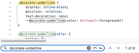
'--decorate-underline-color': colors.foreground, // [!code add]
'&::after': {
content: '""',
position: 'absolute',
width: '100%',
transform: 'scaleX(0)',
height: '2px',
bottom: '0',
left: '0',
transformOrigin: 'bottom right',
transition: 'transform 0.25s ease-out',
},
'&:hover, &.selected': {
'&::after': {
transform: 'scaleX(1)',
transformOrigin: 'bottom left',
backgroundColor: 'var(--decorate-underline-color)', // [!code add]
},
},
}
const styles = {
'.decorate-underline': baseStyle,
...Object.keys(colors).reduce((acc, key) => {
const color = colors[key]
if (typeof color === 'object') {
return Object.keys(color).reduce(
(acc, shade) => ({
...acc,
[`.${e(`decorate-underline-${key}-${shade}`)}`]: {
'--decorate-underline-color': color[shade],
},
}),
acc,
)
}
return acc
}, {}),
}
addUtilities(styles)
})This implementation finally produced the result I wanted. The changes reduced the stylesheet size by over 30%. The only difference now is that I need to apply an additional class if I want the underline to be another color. But this is the expectation when using Tailwind tokens.
Wrapping Up
Tailwind CSS is a highly effective CSS framework with a strong emphasis on productivity. Even when used as-is with its provided defaults and without any plugins, it offers a common atomic abstraction of CSS that not only enables individual developers to build quickly but also allows teams to experiment freely with styling without worrying about CSS bloat — a persistent issue that plagued previous CSS methodologies and frameworks.
Tailwind v4 Addendum
Since the introduction of Tailwind v4 and the move from a JavaScript-based configuration to a CSS-based one, this implementation probably doesn't work anymore. And that's okay. A big part of engineering is weighing the time cost with the benefits. This was an exercise for myself to better understand how Tailwind works under the hood.
I did manage to reimplement it for the new latest Tailwind version, but it no longer supports custom colours beyond the currentColor default, which is probably for the better anyway.
@layer utilities {
  .underlined {
    display: inline-block;
    text-decoration: none;
    position: relative;
    --underlined-color: currentColor;
  }

  .underlined::after {
    content: "";
    position: absolute;
    bottom: 0;
    left: 0;
    height: 2px;
    background-color: currentColor;
    transition: all 300ms ease-in-out;
    width: 0;
  }

  .underlined:hover::after,
  .underlined.underlined-active::after {
    width: 100%;
  }
}